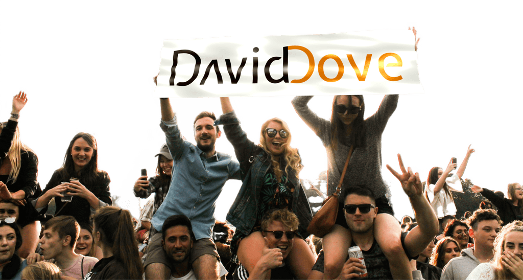
David Dove
As the sole designer of this 0 to 1 project, I aimed to enhance the online presence of a renowned musician who is also an accomplished pedagogue.
The resulting website highlights Dove's artistic identity, engaging audiences and partners. The brand, built from scratch, aligns with Dove's style, providing a user-friendly platform for music and education enthusiasts.
Product Design, Branding, Web-deisgn
UX Design, UX Research, User Interviews, Information Architecture, Web-Design, Wireframing, Prototyping
Entertainment, Education, Non-profit organizations, Media
Challenge
Showcase Dove's artistic persona and engage with audiences and business partners, attracting music enthusiasts and education supporters alike.
Results
Created a brand for David Dove reflecting his music style and artistic philosophy, informed by thorough research into his aesthetic preferences and potential audiences.
Designed a website benefiting both Dove personally and his organization by effectively sorting diverse sources and media.
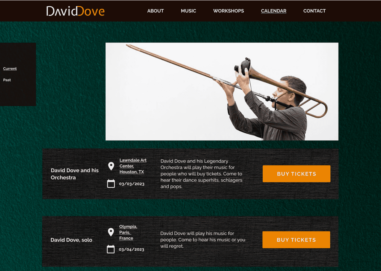
Established clear, simple navigation by diversifying pages to effectively share both music and education information while ensuring user-friendliness
97%
Improved online presence
75%
Decrease in time spent on search for required information
85%
Increase in content quality, quantity and accessibility
Preliminary Research
I conducted multiple interviews with the client and held brief consultations with his colleagues and audience members. This process guided me in prioritizing tasks and shaping the essential features of the website. As a result, certain features gained top priority.
The website must:
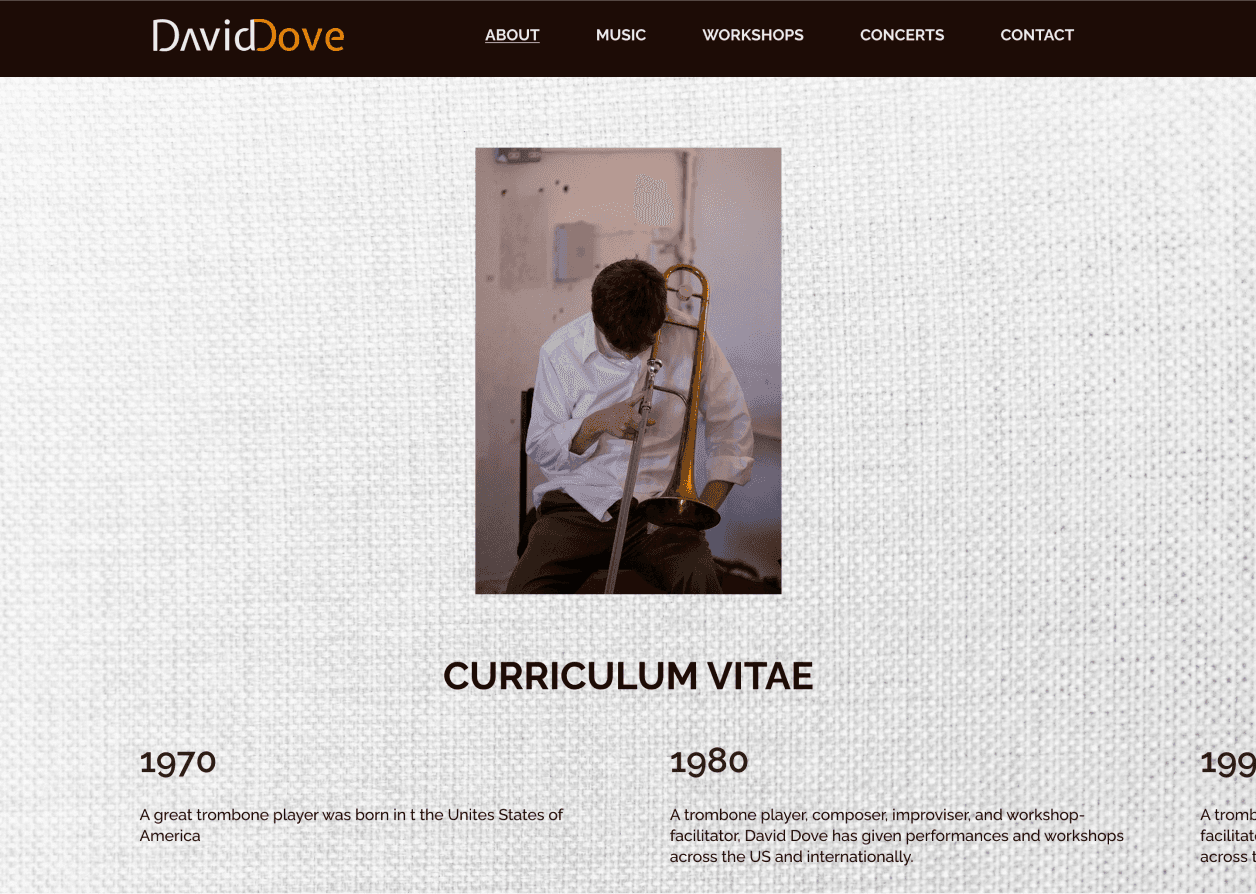
Clearly present David as both a musician and educator.
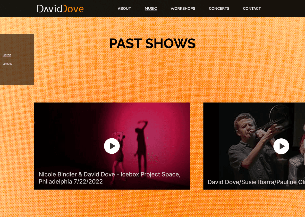
Capture the interest of David's music fans, providing seamless access to his music and tour schedules.
Concisely explain and compellingly advertise David's educational projects.
Ensure that booking agents can effortlessly access Dove's bio and CV.

What is Unusual?
David, the performing musician, can leverage a distinct personal brand.
David is an unconventional, avant-garde musician within a niche.
David, the educator, thrives on engaging with an eclectic mix of learners.
Insights Out!
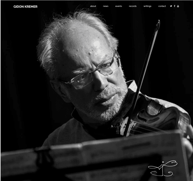
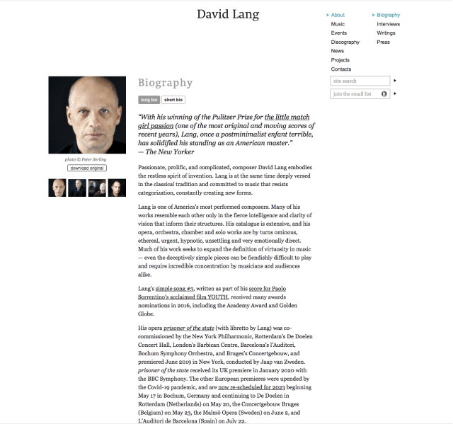
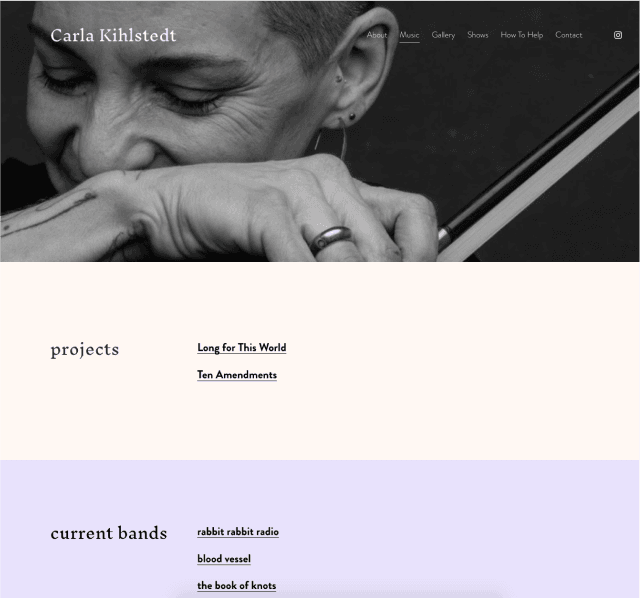
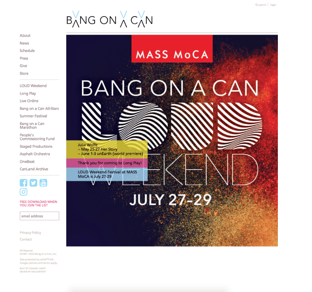
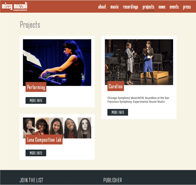
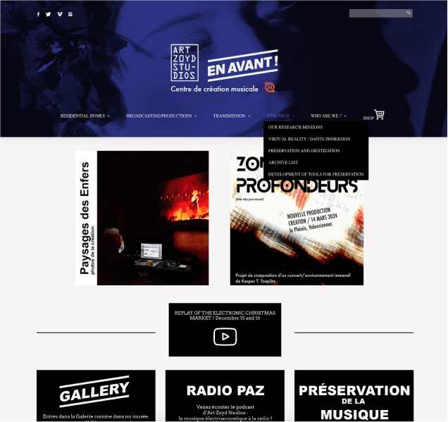
In contrast to most music websites, which often prioritize aesthetics over utility, the selected sites all feature a highly practical structure:
There is at least one navigation bar, often in both the header and sidebar, ensuring intuitive browsing.
The contact option is instantly accessible from anywhere on the site. "Music" and "Projects" are distinct, though not always clear in their scope.
In the newsfeed, music updates rarely take center stage, with the primary focus on projects, whether music-related or not.
A "support" call-to-action button is often featured on the front page or key sections.
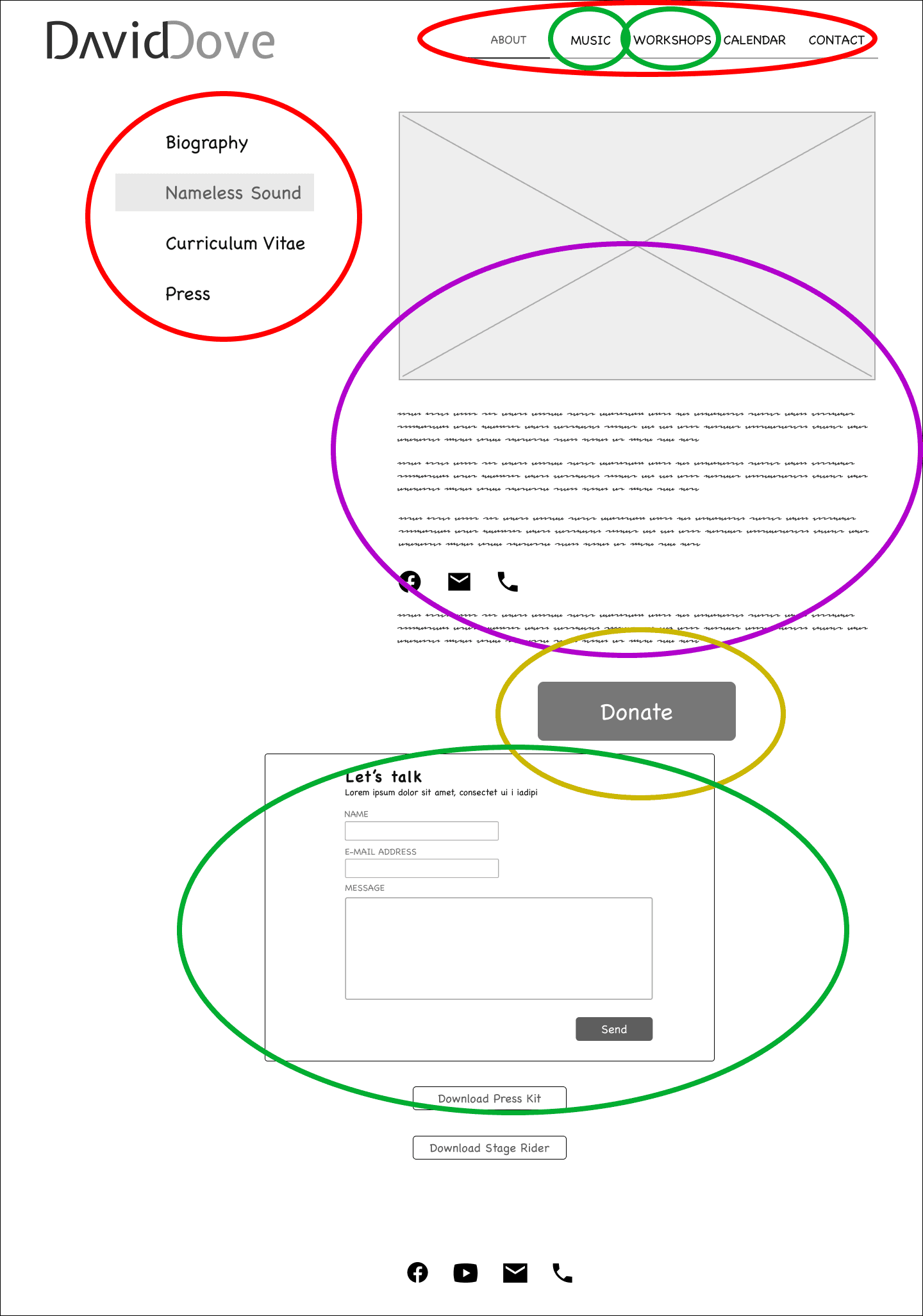
Mapping the Site
The site map was designed with these principles:
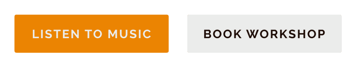
Music must be instantly accessible, but no autoplay is planned.
Workshop information must be immediately accessible.
David's biographical info and concert schedule should have unmistakable access points.
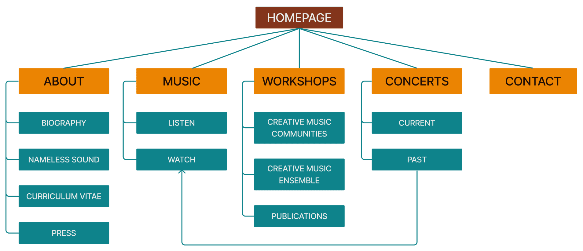
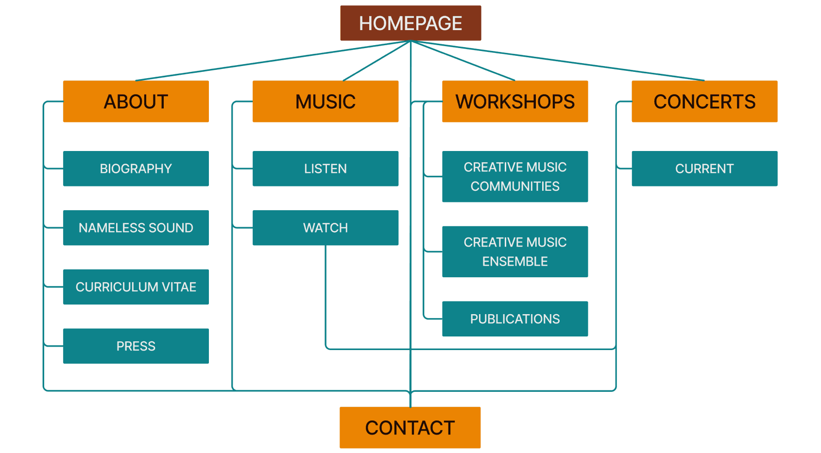
The initial site map overlooked the necessity for the contact form to be easily accessible throughout navigation.
After the initial wireframing, the site map was revised, designating the contact form as a separate page accessible from any point.
Site Layouts
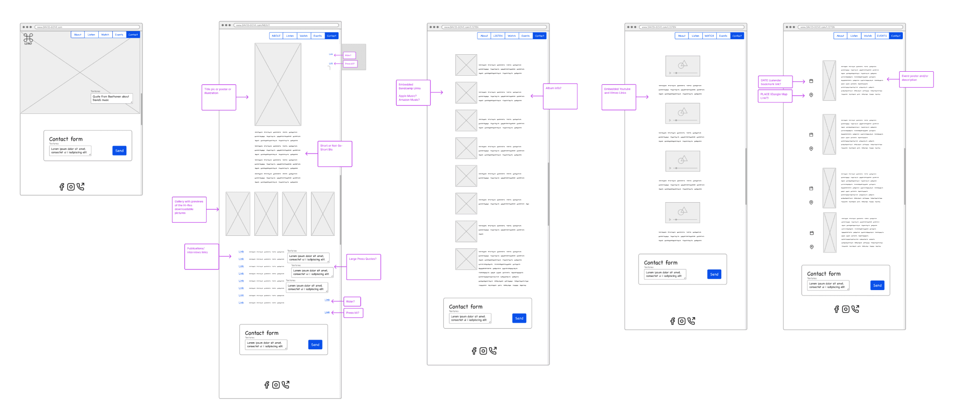
The site map was transformed into wireframes, highlighting the main pages.
Addressing both content coherence and structural interactions was a formidable challenge.
View in Figma
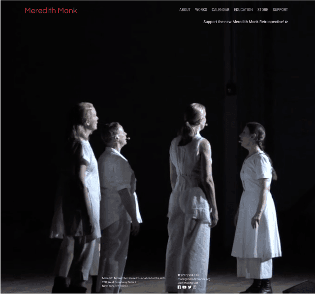
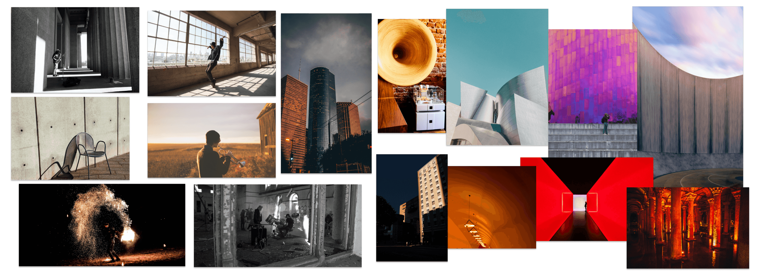
I created 5 mood boards, each representing a facet of David's creativity. They featured real-world art pieces with unique acoustic qualities, reflecting his down-to-earth approach, acoustic experiments, and Deep Listening theories
In accordance with his preferences and explanations, the main inspirations were:
urban landscapes
Bauhaus and deconstructivist architecture/interior design
Mark Rothko’s abstract paintings
Logos vs Chaos
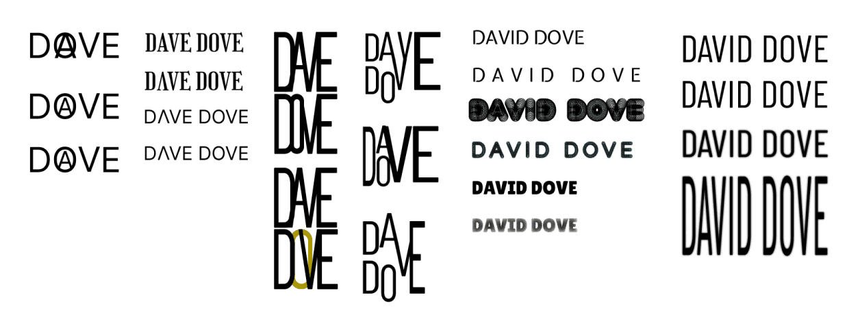
Logo work started with letter experiments on David's alliterated name.
As per our mood board discussions, the logo was envisioned as a blend of urban style and deconstructionism. Spoiler alert: it didn't pan out.
Next, we tried integrating trombone into the logo.
The initial tries (check out the first row) had a vibrant New Orleans vibe, a far cry from Dove's aesthetic.
The attempt was unsuccessful because simplifying the visually complex trombone led to unintended comic effects.
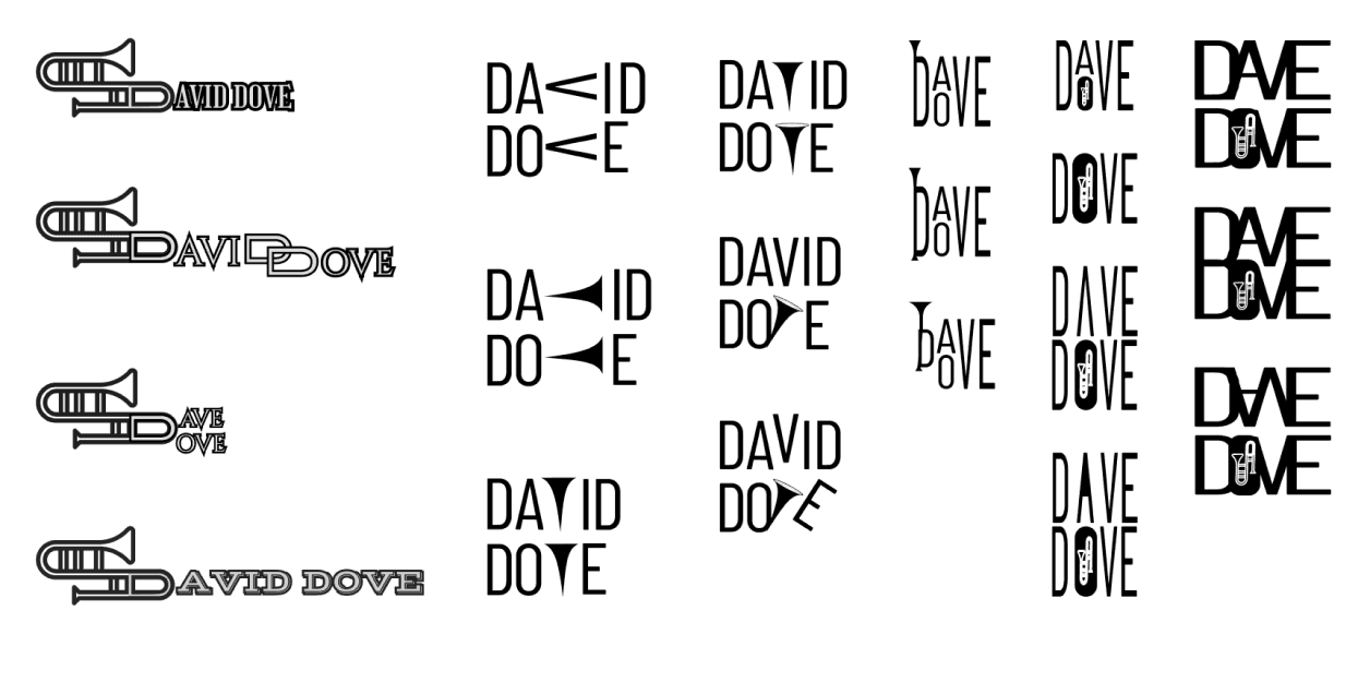
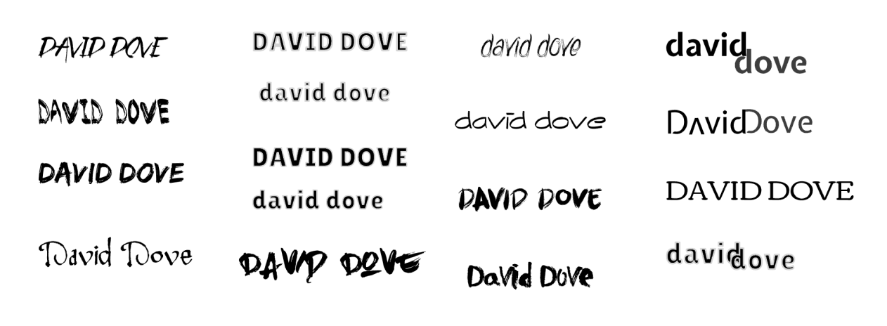
Following discussions with David and his potential audience, I revisited the "name-logo" concept.
I sought simplicity that echoes David's creative brilliance, wit, and avant-garde passion, without overwhelming.
Following discussions with David and his potential audience, I revisited the "name-logo" concept.
I sought simplicity that echoes David's creative brilliance, wit, and avant-garde passion, without overwhelming.


Tile Out
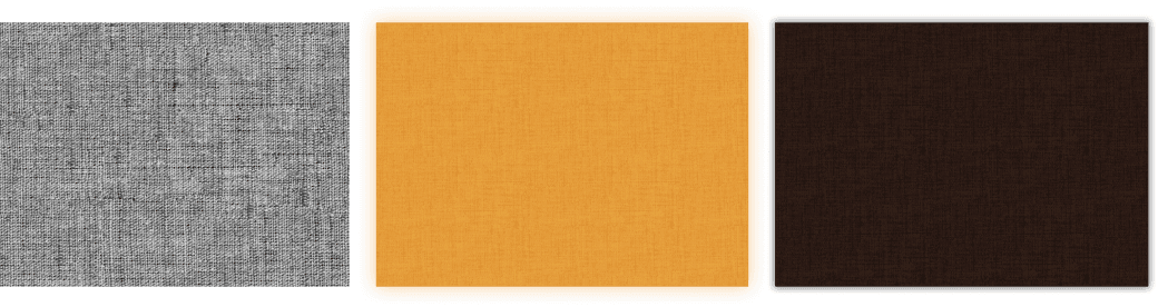
The style tile was crafted, featuring David's preferred dark brown, green, yellow, and white as both primary and secondary colors.
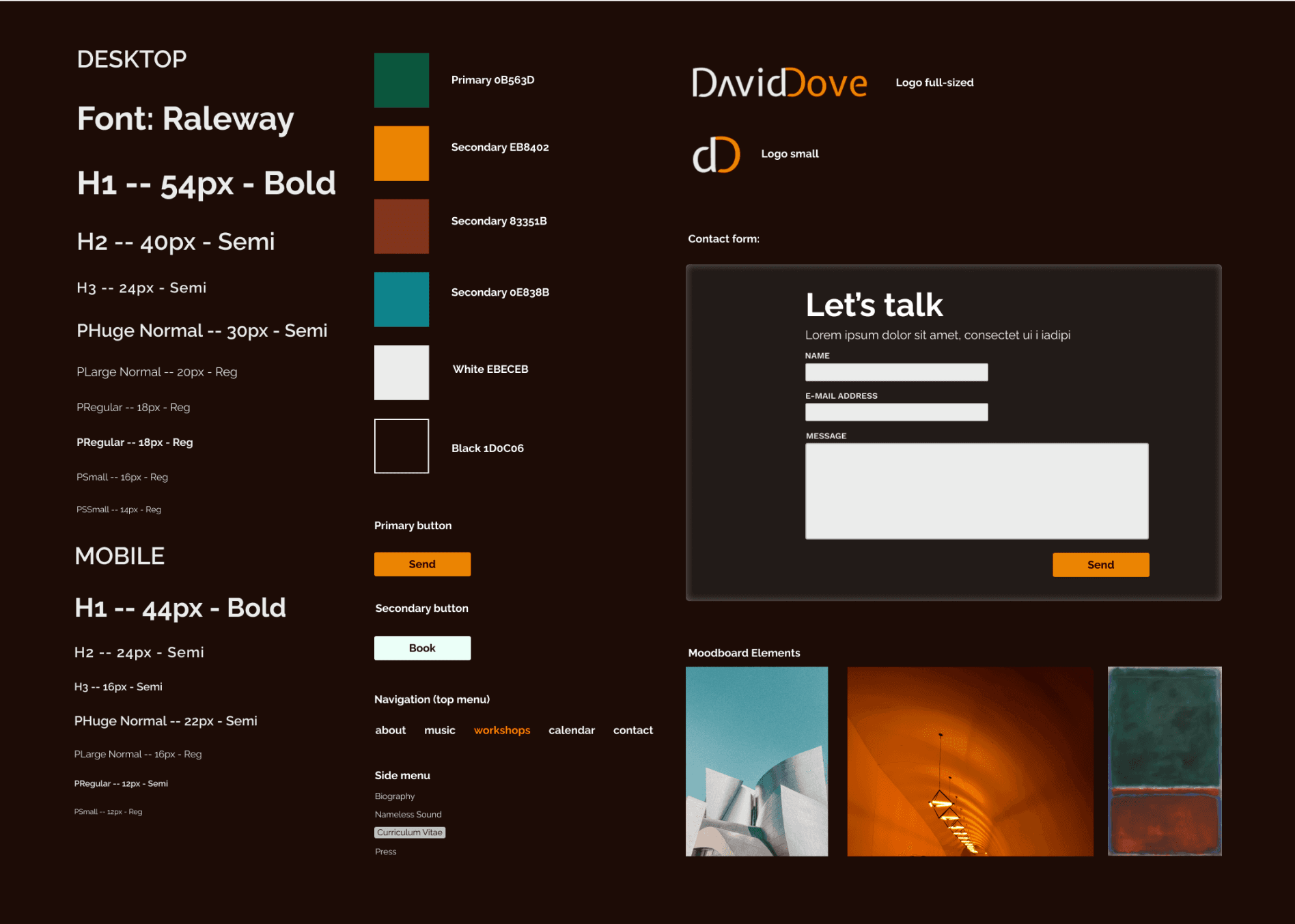
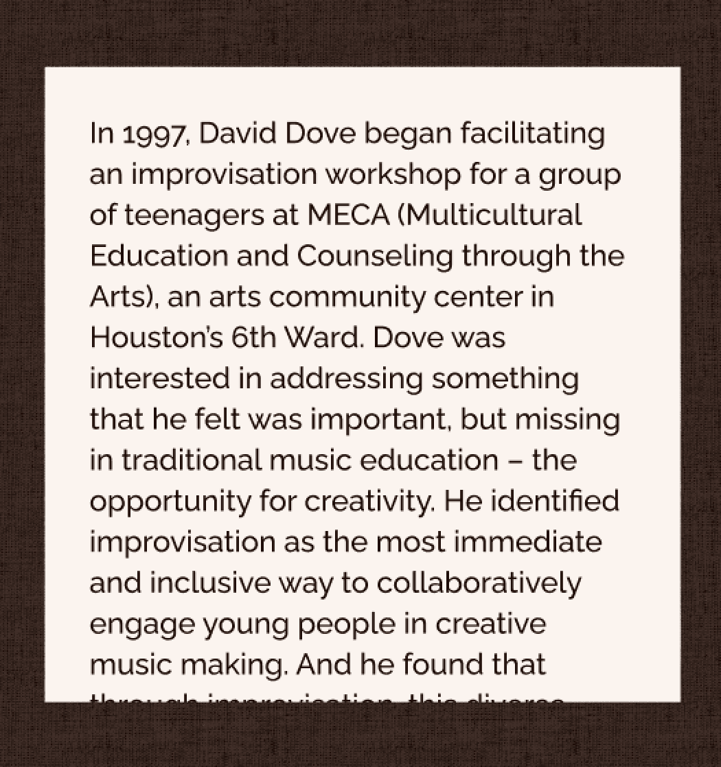
To create webpage backgrounds, I experimented with canvas and painted wall textures, reminiscent of Rothko, Dove's favorite painter.
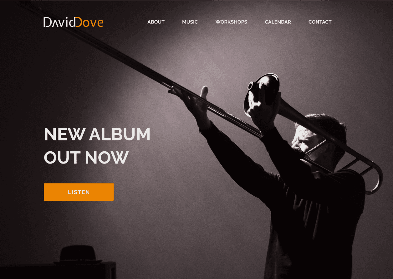
First, desktop hi-fi wireframes were created, keeping mobile lo-fi wireframes in mind.
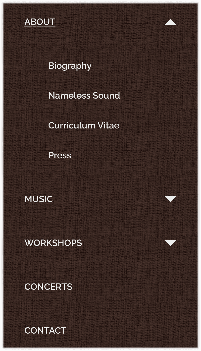
Mobile Version
The mobile version was easily achieved due to the straightforward grid, component system, and layout choices.
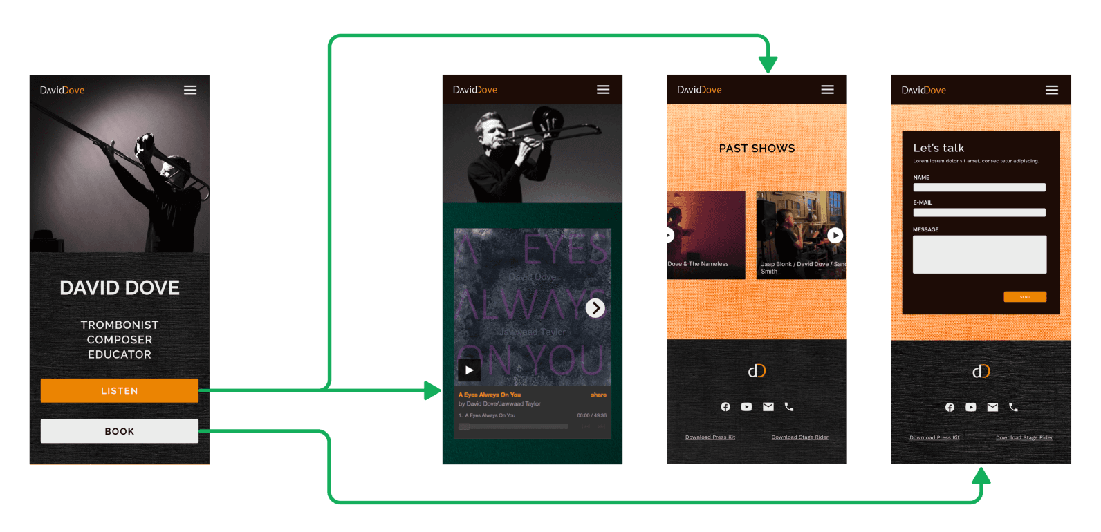
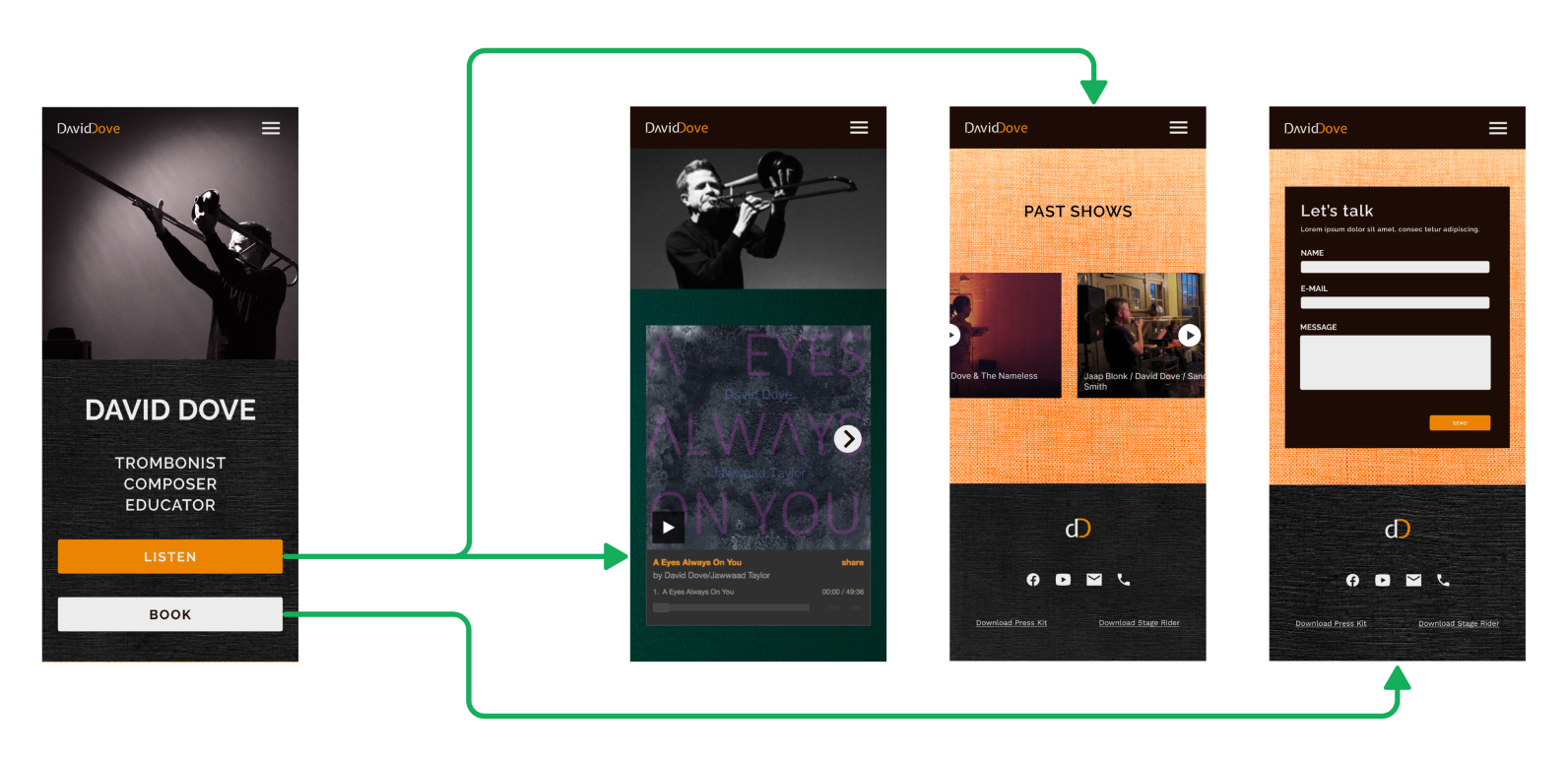
These wireframes demonstrate the effortless access to key website sections directly from the homepage.
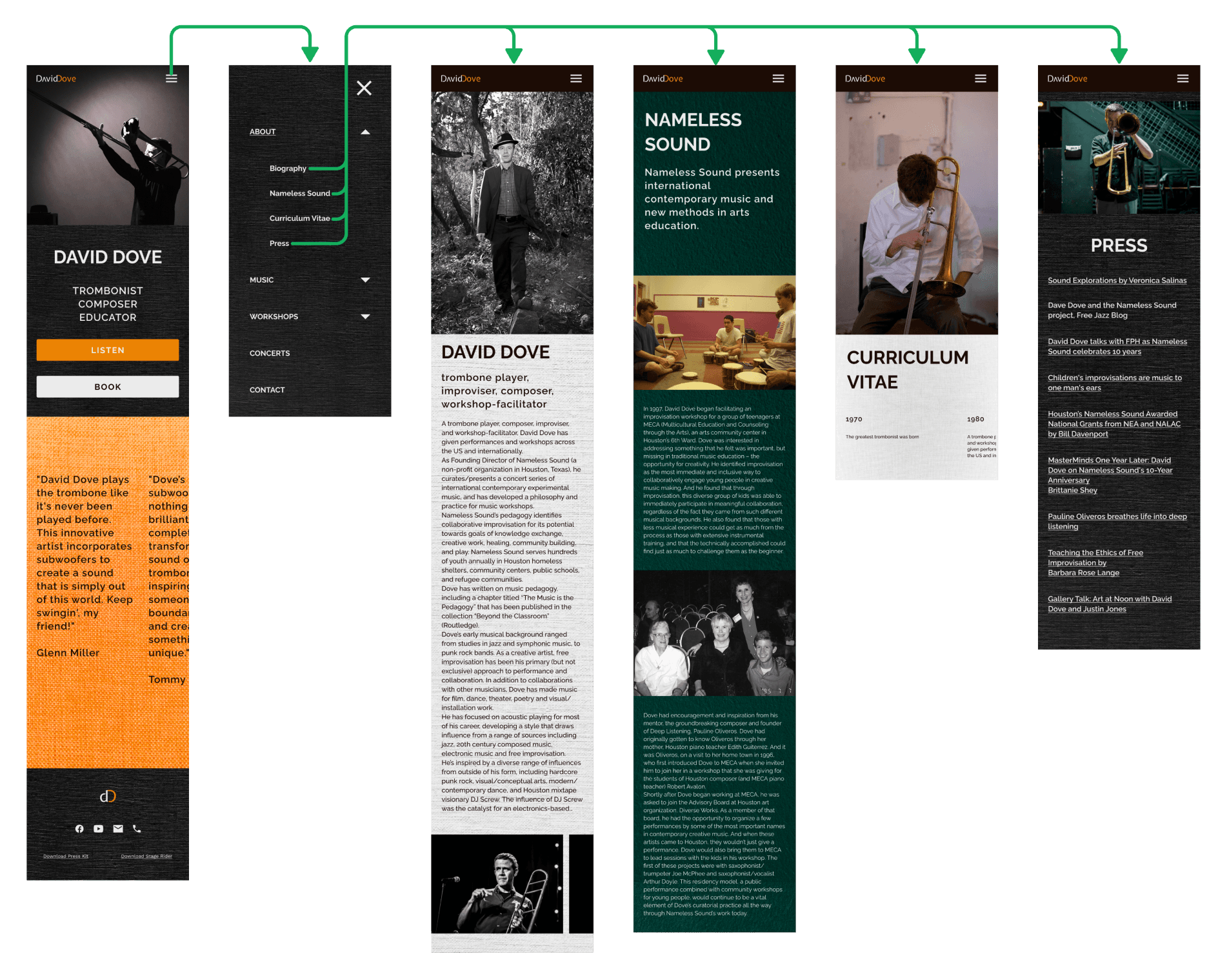
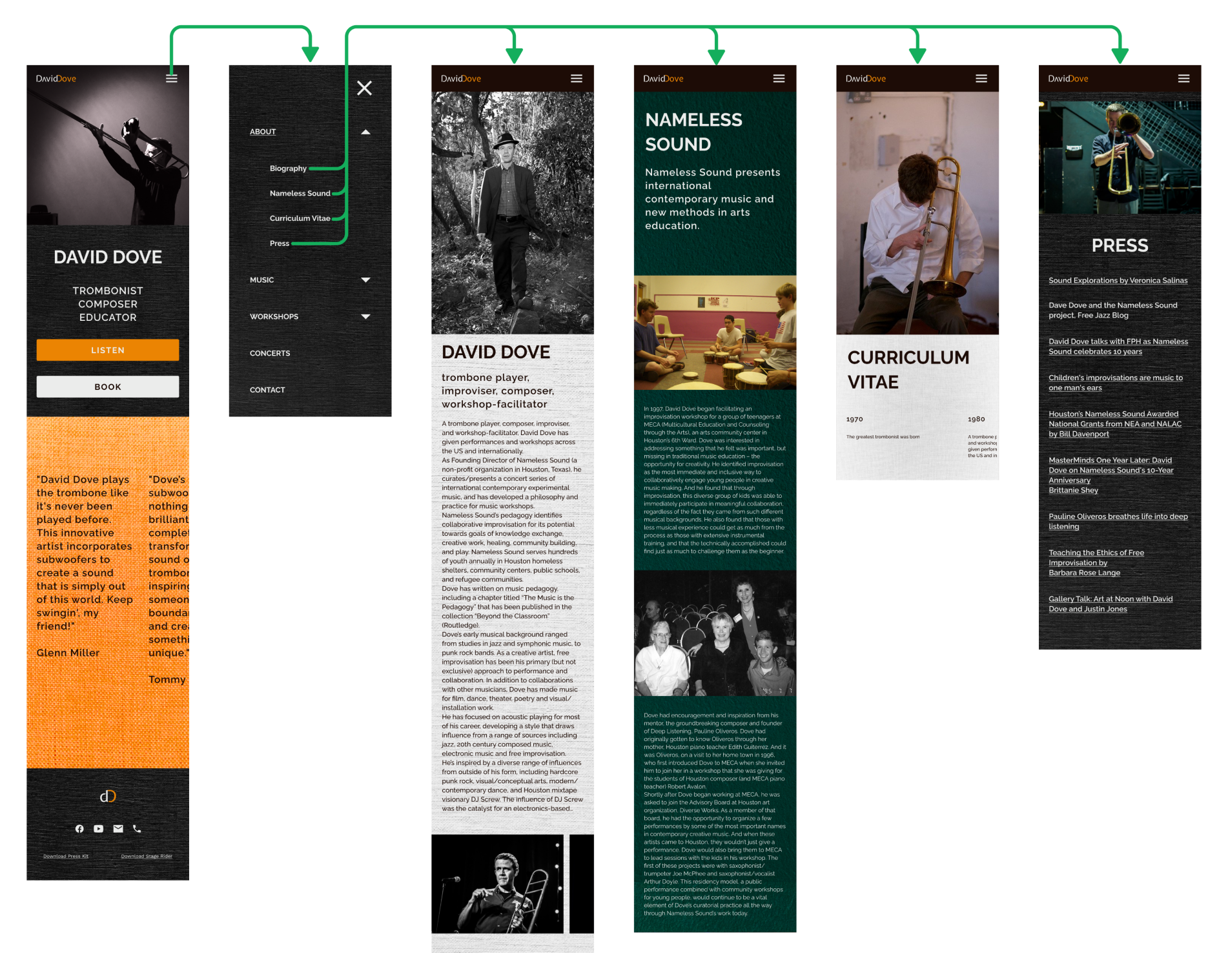
In the mobile version, all sections are instantly accessible through the hamburger menu and its submenus.
User testing was successful, with testers accurately describing the individual, indicating that the personal brand and info resources effectively fulfilled their purpose.
Users navigated to essential website sections with ease. However, we identified several UX issues: